Disclaimer: I love the Aeros. The new 5.0 release is a major upgrade for many reasons. Just the existence of Albums makes it finally a giggable tool without the need for a MIDI controller. Great work. As a product manager for a software company, I know how hard big releases like this are. Well done.
A lot of people have requested that Singular should “make the text bigger” on the Aeros. My request, though similar on the surface, is more about making the Aeros an easier tool with which to gig.
Brennan and Team - put your “live performer” hat on. The room is dark. Stage lights. Other lights. A LOT of visual noise. Right up front, I want to get to my setlist quickly. In between songs, I need to answer the question: “What song is next?”, “What song do I want to play?”, or “Is my Aeros on the right song?”. The song title is the most important piece of information. All other info is secondary. The Songs and Song Dashboard screens are the key UIs here.
Problem: in this use case, the UI is hard to navigate due to the small text size for important UI elements.
Using very crude tools (I’m not a UI designer), I created some mockups to illustrate my points.
Songs
Left is the current UI. Right is my mockup. I removed elements that don’t matter to me in this use case. Most of these should be on the Song Dashboard (2nd page).
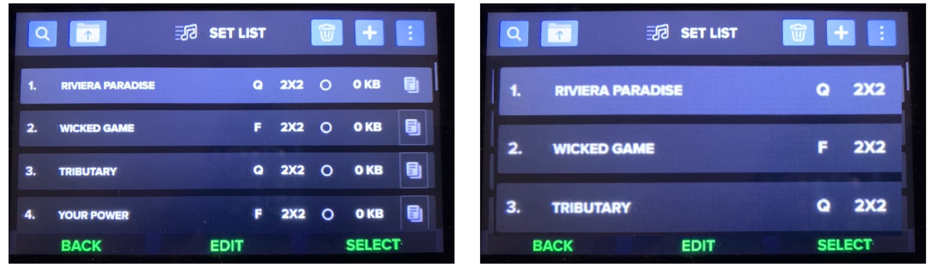
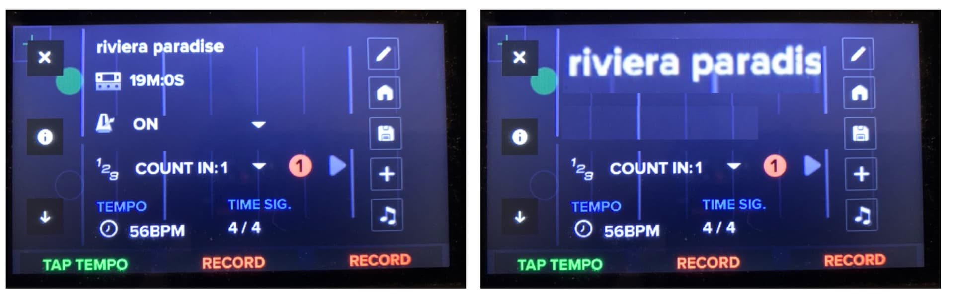
Taking it a step further, you could increase the text size of just the song title. The mockup below feels a little comically large to me, but you get the point. I also used all caps in my titles to help with the issue currently, so this affects the mock. Mixed case titles might be less comical?
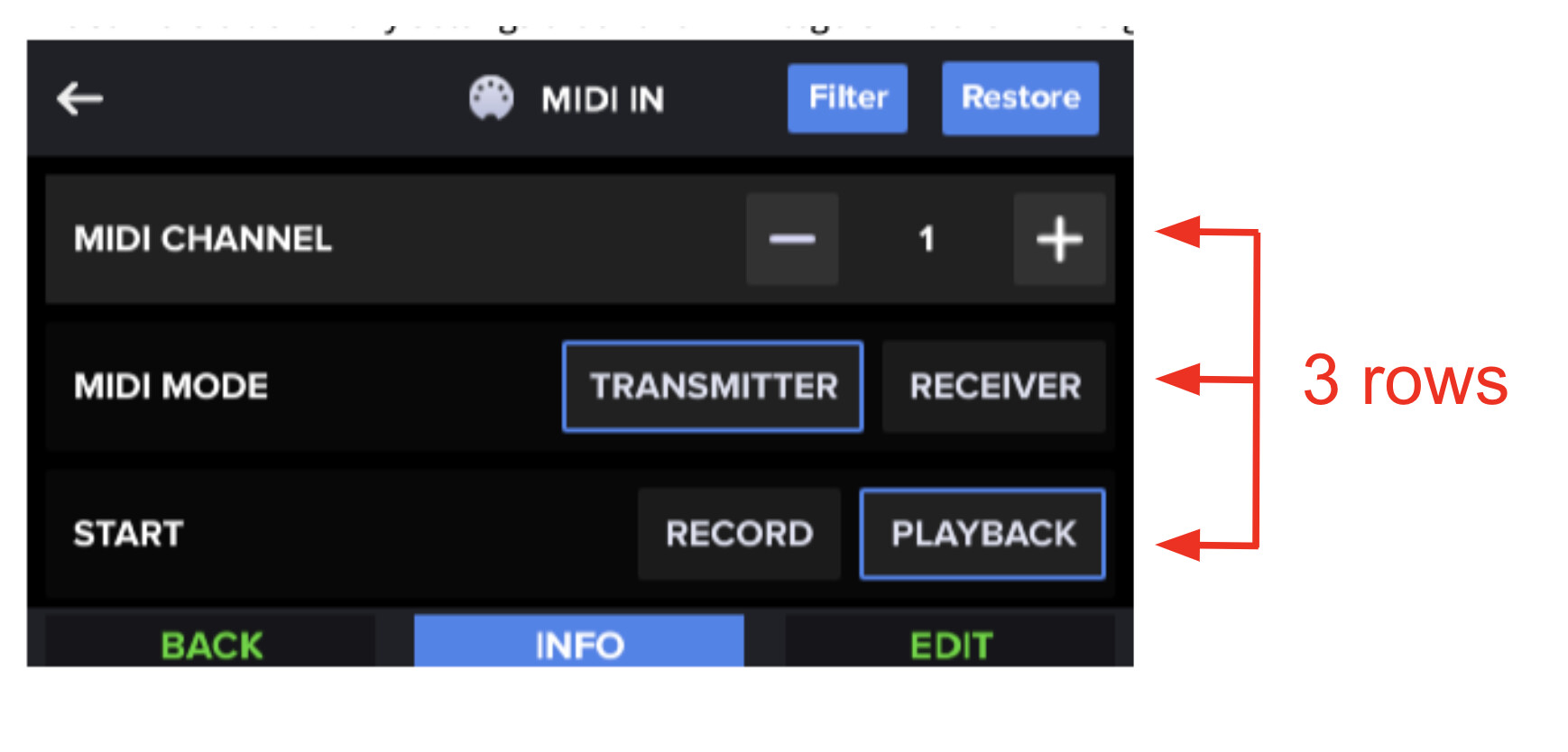
The Aeros has an internal UI pattern for “3 rows”. Look in Behavior, etc. menus. At a minimum, just use this pattern.
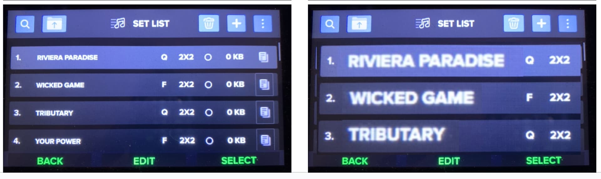
Song Dashboard
Again, in a gigging situation, the most important piece of information is “What song is this?”. Existing UI on the left. My mockup on the right. Notice both the larger text for the song title as well as the visual break introduced by removing the Time Left and Click UI elements. This space allows my brain to more easily grock the song title in this darkly lit bar. Time Left and Click UI can be moved to page 2.
Since I know these songs well, I really don’t need to look beneath the visual break to read the details. I just need to confirm that I’m on the right song. If for any reason I need to remind myself about the count in, BPM, time signature (“Oh, this is the one in 6 / 8!”, whatever), then I can choose to look at the lower portion of the screen to get that detail.
Try it out: look quickly at the existing screen on the left. I know my eyes have to slowly scan a bit up and to the left to read the title. Now, look at the screen on the right. My eyes instantly go to the title and there is no scanning. This is so much easier to handle in a higher pressure live gigging situation.
To be clear, I’m OK with long titles getting truncated. I know the songs on the list and my brain completes the song title because I know them already. The mock above truncates at 15 chars. Anecdotally, I have 22 songs currently in my Aeros and only 5 have titles longer than 15 chars. But in all of these cases, I know the song after the first 5-8 characters.
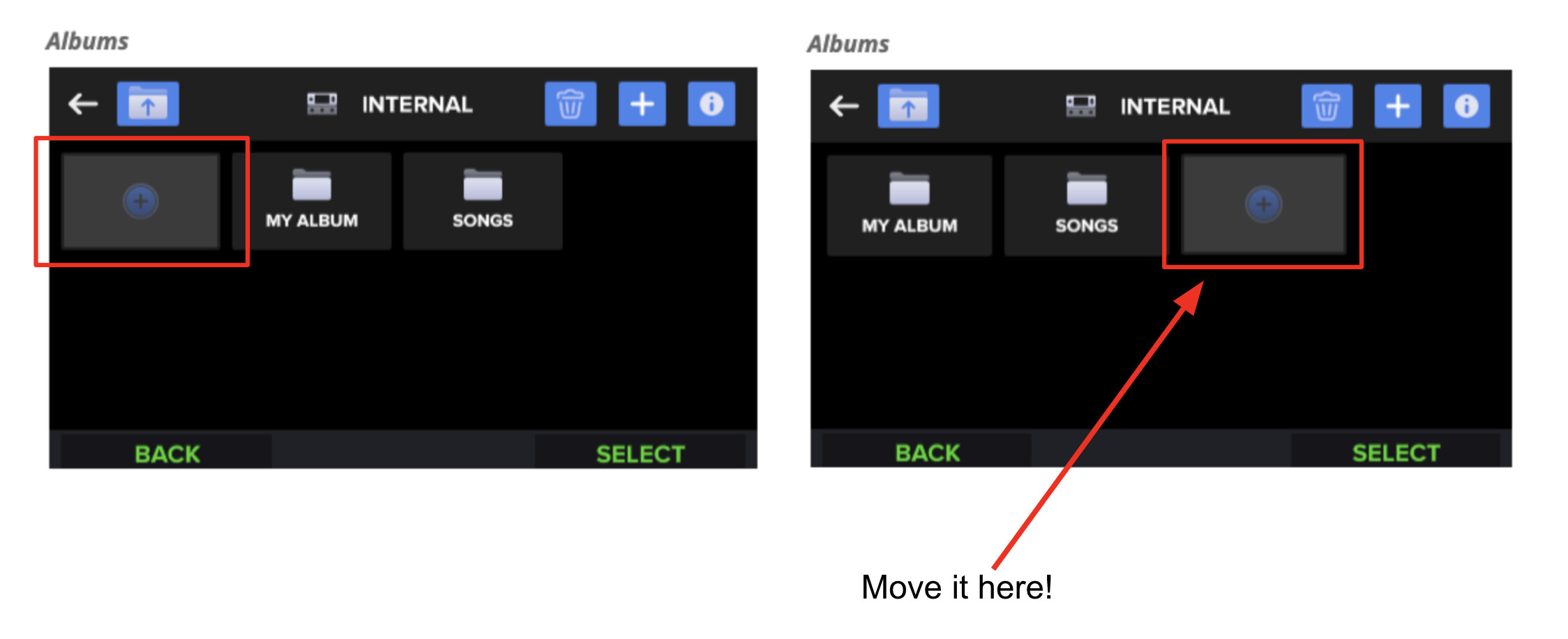
Albums
Move the “Add” option to the end. Once the user has initially created their Albums (at home), the Add option will be the least selected option on the page. You certainly won’t be adding a new Album in a gigging situation. Think: how often is a user selecting an existing album vs. creating a new one? Put the Add option at the end so the user doesn’t have to skip over this option every time to get their desired Album. It also helps prevent inadvertently creating a new album (especially when using their feet to navigate “hands free” in a live gigging situation) and having to back out of that just to get to their desired album. Moreover, if you are like me and only have a single “Songs” Album, if the Add is moved to the end, the my “Songs” Album is the default selection when getting to this screen. Therefore, I don’t have to use my foot to control the roller control to select an Album because I can just hit the right button and choose “Select”. Much faster in a live situation.
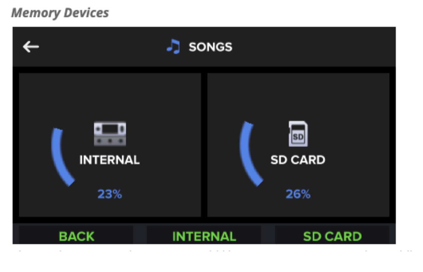
Memory Devices
If there is no SD card in the Aeros (I don’t keep one in), the user shouldn’t be shown the following screen. The UX should take the user directly to the next screen, because there is only one option (“Internal”). It is an unnecessary action to have to select the one available option. If the user inserts a card, then the system should detect that state and present the user the option during navigation.
Aeros Team - I’d encourage you to take the unit into an actual situation (on stage in a real-world lit bar/venue) to experience what I’m talking about. Remember: If the user is standing, an average person’s eyes will be 5+ feet away from the Aeros screen. Add that to the equation.
Thanks for listening, and best of luck with the product. I’m sold on it as the best looper in the industry.
David Gee